Case Studies
Invictus

Overview
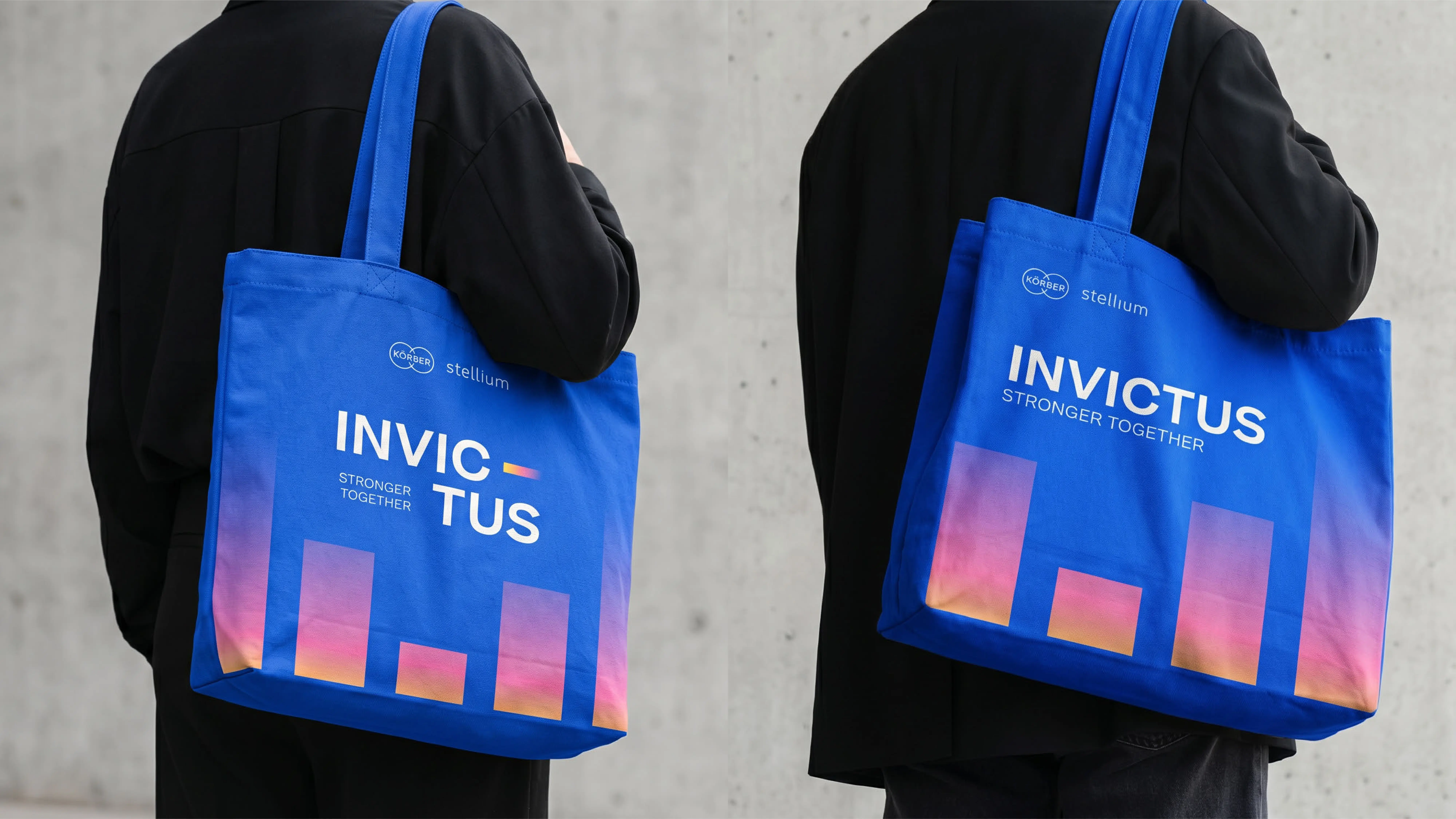
Invictus was an internal event marking a new chapter for Körber Stellium following the merger of Körber and Stellium. The identity needed to communicate the idea that bringing the two organisations together created something stronger, while giving the team a positive and energising perspective on the change.
As the Senior Brand Designer, I developed a visual direction that brought the two brand worlds together through abstraction, vibrant forms, and a more expressive event aesthetic.
Client:
Körber Stellium
Industry:
Supply Chain & Logistics Technology
Services:
Event Branding
Creative Direction
Environmental Design
Merchandise
Project Background
Körber Stellium brings together Körber's technology and expertise with Stellium's experience in supply chain and logistics. Invictus was created as a platform for the organisation to bring its people together, celebrate its progress, and look ahead to its next chapter as one team. With the merger creating a new organisational identity, the event became an opportunity to visually communicate the idea behind the change: two organisations coming together not simply as a combination, but as a stronger collective.
The Challenge
The identity needed to communicate unity while respecting the visual equity of both organisations.

- Bringing Körber's established brand language together with Stellium's promise.
- Communicating the merger as a positive evolution rather than a disruption.
- Creating an event identity distinctive enough to stand out within the existing corporate framework.
Solution
The Solution
1/3
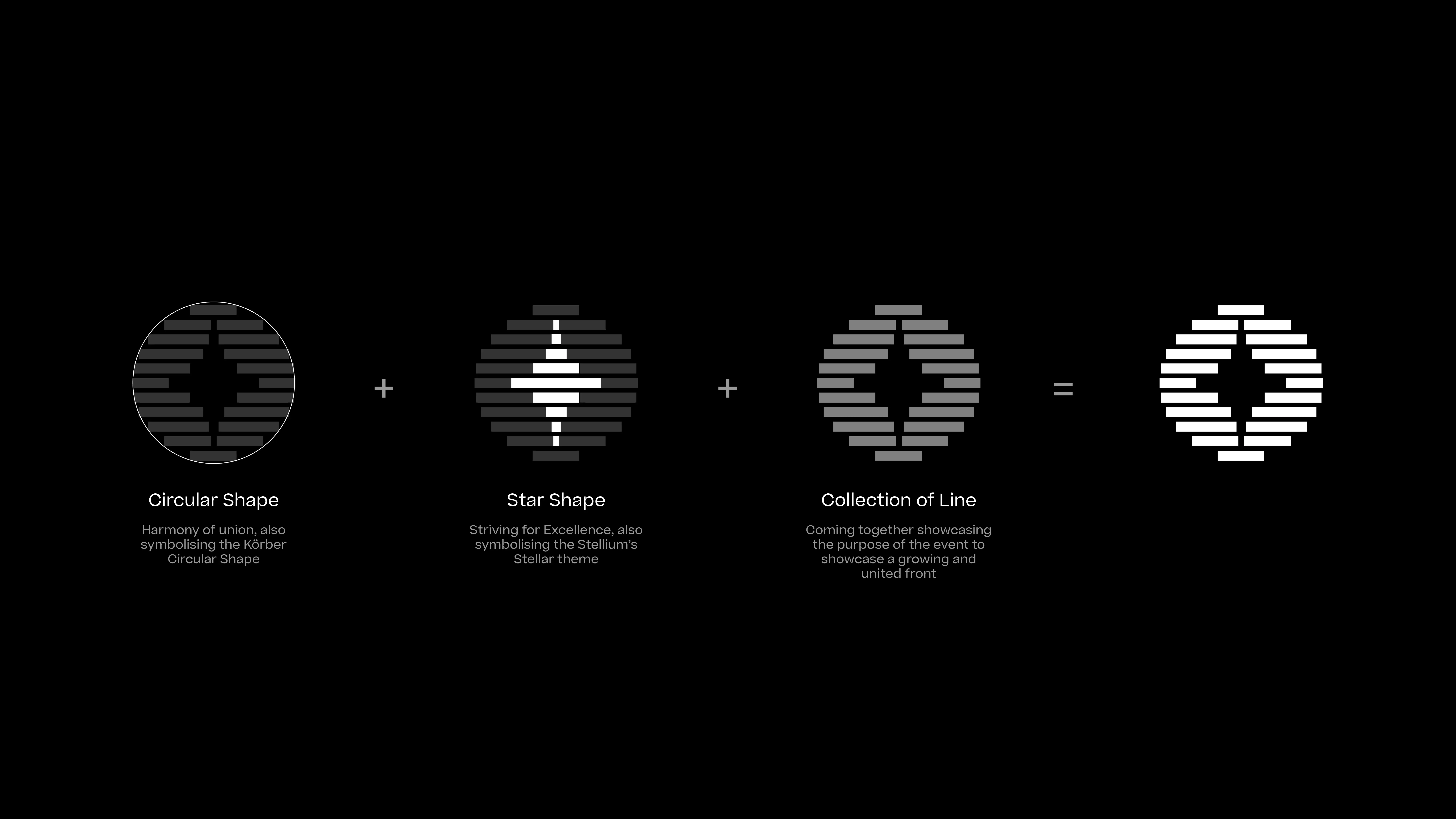
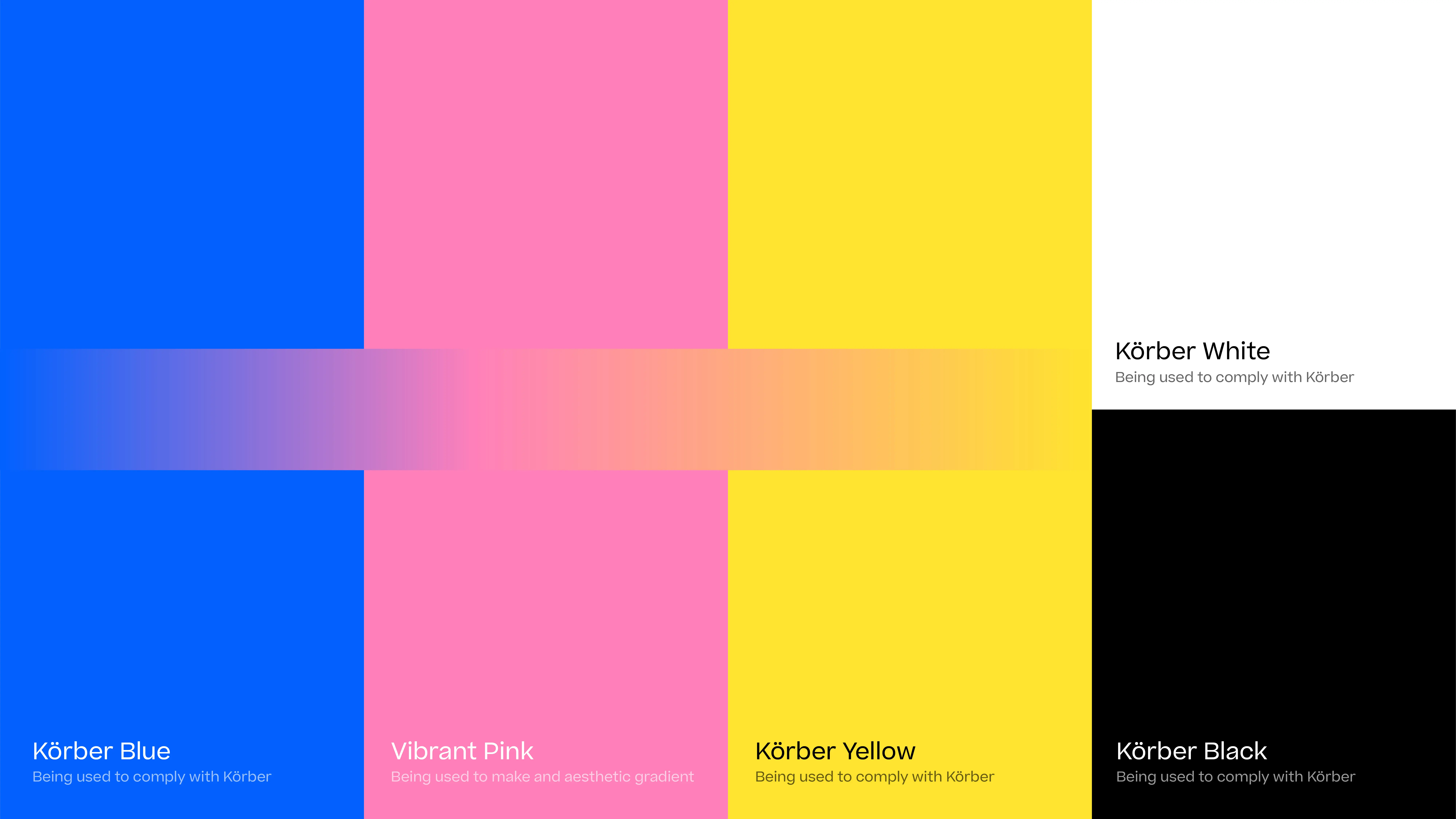
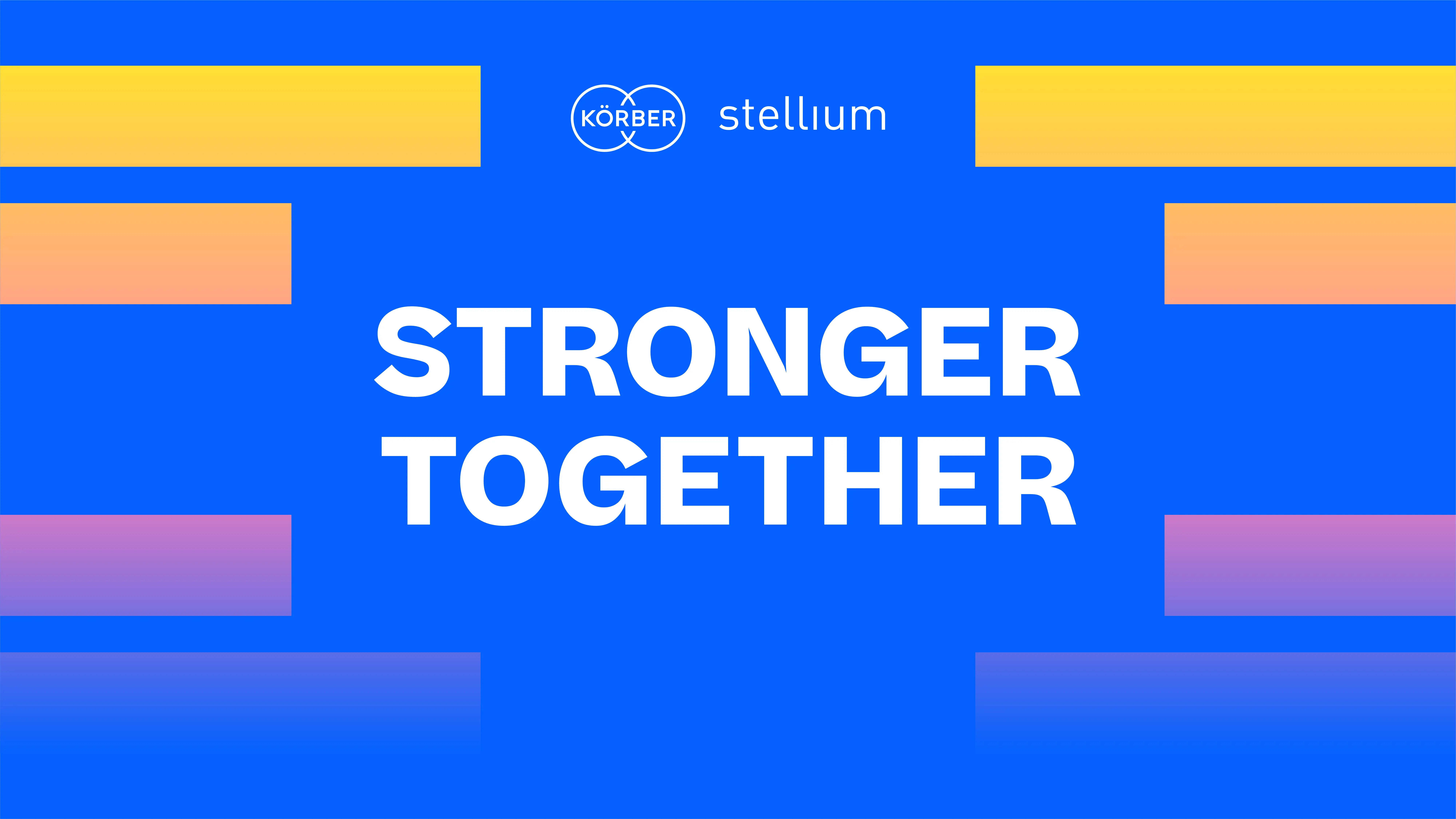
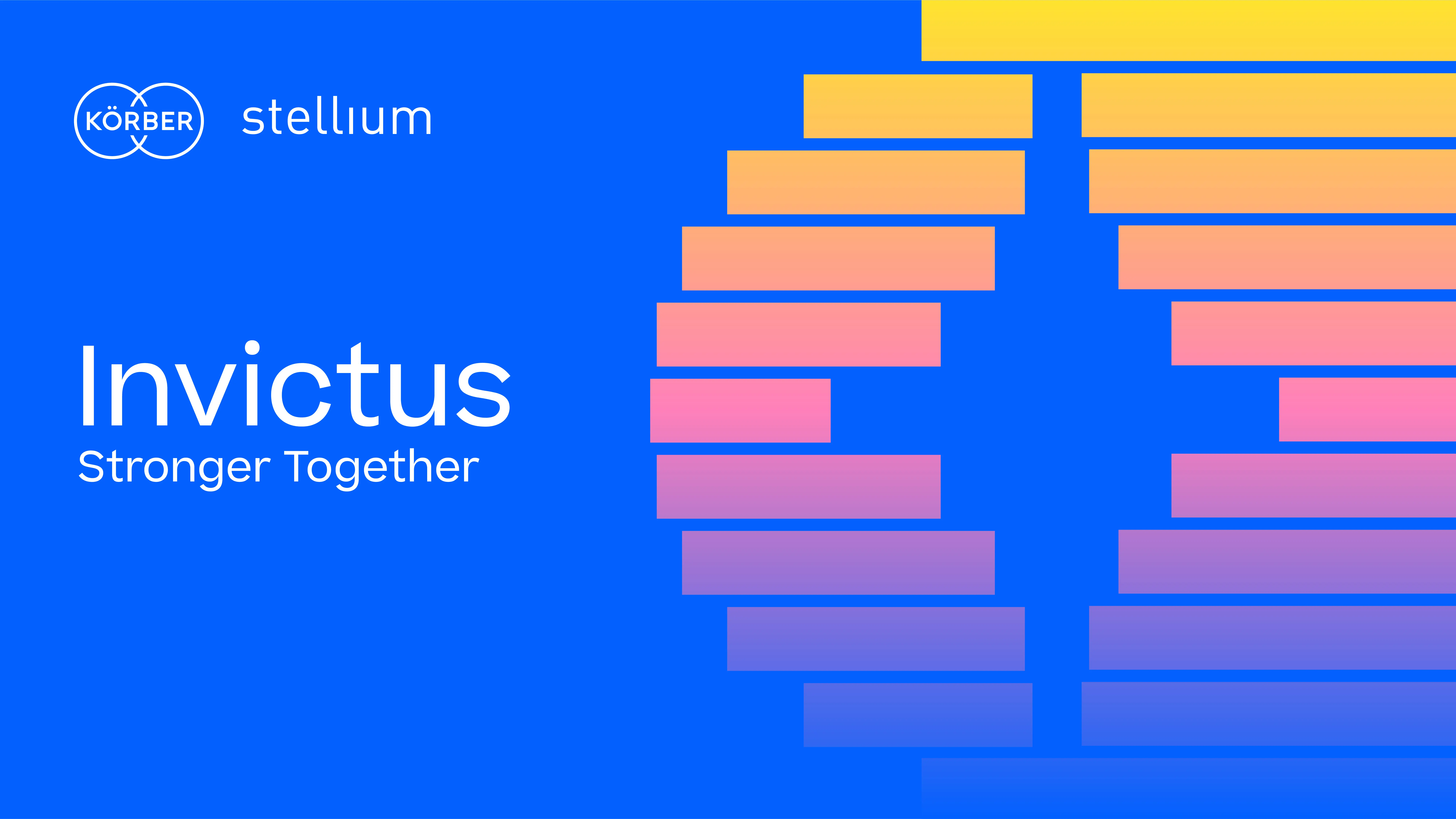
I developed a fresh, expressive visual language built around abstraction and vibrant geometric forms. The shapes represented movement, connection, and the coming together of different elements, creating a visual metaphor for the new organisation. Rather than simply combining existing brand assets, the approach created something new from the relationship between them. This allowed the Invictus identity to feel connected to Körber Stellium while still having the energy and individuality expected from a major internal event.
Key Takeaway
Key Takeaway
The most interesting part of the project was exploring how abstraction could communicate something as complex as organisational change. It reinforced how a strong visual idea can turn an internal message into something people can see, feel, and participate in.